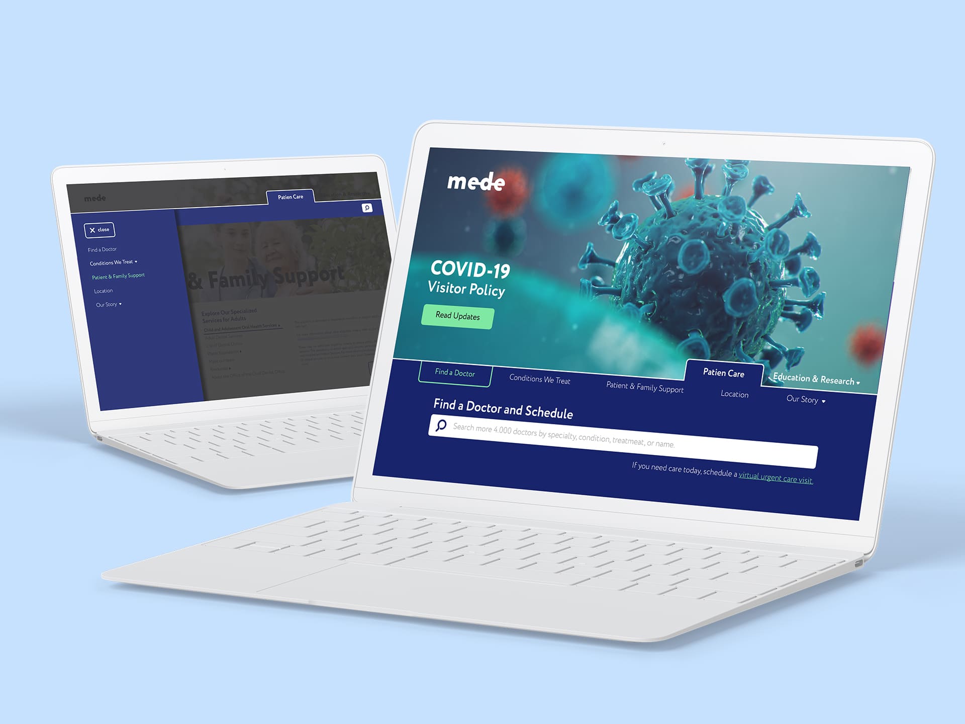
Since the healthcare topic is quite popular now, I decided to share with you our exciting experience in developing a web app for patients. That was a large and serious project that our team (and not only) was working on for several years.
I have to omit all names and some details for certain reasons: the screenshots in the article also serve a demonstration purpose only – the real application looks a little different, but I hope you will still enjoy this article.
The client urgently needed to extend the team to develop the application. And since we already had a positive experience of cooperation, they turned to us.
The product itself is a large-scale, multifunctional web application that allows you to quickly find a doctor of any specialization, make an appointment, or receive an online consultation.
Our team worked only on a part of the functionality, and particularly this features we will discuss in this article.
Below I will describe the main tasks that were set for our team and the way we solved them.
The application has a partner information section that contains a lot of video files. To accomplish the task, we used the Brightcove service, which allowed to compress video files to the necessary parameters and assign a specific ID to each video. This speeds up the loading of video content and makes the process of placing files easier.
The web app for patients has a separate unit allowing to quickly find the doctor you need: the user can go to the page, chose a specific state/district and see the locations of partner doctors on the map with all the necessary additional information, and make an appointment, or contact a specialist for online consultations. To implement this feature, we used Google Maps.
The client requested to create a section, which contains all the most relevant information about the virus and the epidemiological situation. By following the link from the pop-up banner, the patient can make an appointment, or request an online consultation.
One of the most important tasks of the project was to adapt the application for people with visual impairments. For this task, on all pages, we used HTML Accessibility, which allows users to listen and navigate the content of the app. Voicing is carried out via screen readers – VoiceOver for macOS and iOS, TalkBack for Android, and NV Access for Windows.
By the way, if you are interested in the topic of Accessibility, then you might also like the interview with our Accessibility testing specialist.
The application contains a section of diseases that are studied and treated at the medical center. This section contains detailed information about the diseases and real cases.
When creating this section, we used CKEditor to facilitate the work of content managers. For the detailed display of specific objects – blocks with quotes, galleries, blocks with relevant stories, etc. – we developed additional plugins. When creating an object, a content manager can select a ready-made template for a certain block, then insert a text and everything will be displayed on the screen in the required format.
For the block of diseases, we also developed a plugin that allows content managers to add videos from another services to CKEditor.
To configure localization, we developed a separate component on React, which allows users to switch between different languages (10 languages).
This web app for patients has a complex menu, which could slow down the loading of pages. Based on client’s requirements, we created HTML documents with a menu item title and the necessary data, and then documents were added to the project. When you first enter the website, the menu is loaded and cached, which speeds up the work of application.
The app also contains many other static elements. Not to overload the servers, different levels of caching are used there. The first level is performed via Symfony, which acts as a link for the frontend and Drupal, and when the page is fully formed, everything is cached via Varnish.
Our team faced the task of adapting the application interface to the main types of modern devices – computers, tablets and smartphones. In this regard, client’s designers created a separate design for each type of device. To implement this, we used a grid-based layout system. Thus, depending on the device screen parameters, the application interface is displayed in the relevant size.
Since the app has a lot of graphic content, it also had to be adapted so that the images uploaded in the original size would not slow down the page loading on mobile devices. For this, our experts developed a special module for Drupal. Now, when adding the content, it is necessary to upload only one picture of the original size, and the module creates 3 copies of different quality for certain devices and loads what is needed.

For users:
For administrators:
As a result, the client received a multifunctional web app for patients that greatly simplifies the process of finding the necessary medical specialist for end users, as well as simplifies the content management process for site administrators.