Blog
One-page Checkout: Recipe to Increase Conversions in eCommerce
Business
Design & Marketing
E-commerce development

The unwritten rule of eCommerce is that every extra action performed during checkout reduces the likelihood of the customer completing a purchase. And this assertion makes sense considering that the average cart abandonment rate is 70% — a significant loss in potential profit.
To mitigate these losses and boost conversions, online retailers are exploring ways of shortening the customer’s path to final payment. Gone are the days of long, scary checkout forms. Up steps the one-page checkout solution to help eCommerce retailers simplify all complex checkout processes.
Let’s explore the impacts of multi- and single-page checkouts on conversions. We’ll also discuss tips to help business owners optimize checkout processes.
As mentioned earlier, the average cart abandonment rate for eCommerce platforms is 70% for websites and 86% for mobile sites, according to Sleeknote. In simpler terms, 7 to 8 out of 10 shoppers leave your website or app without completing their purchase — and that’s in the best-case scenario.
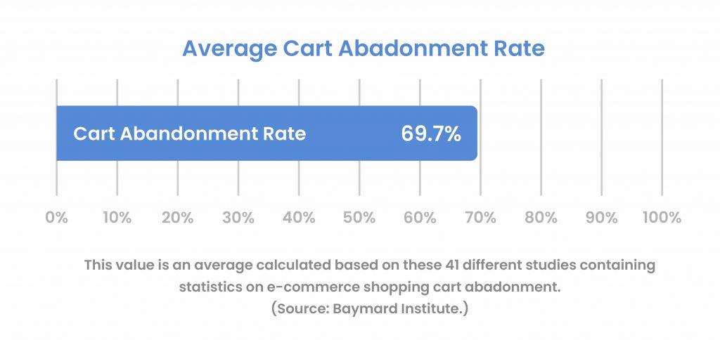
These numbers translate to an over $18 billion loss in annual revenue for eCommerce brands.
The same Sleeknote research also shows that 57% of shoppers will abandon your site if it takes more than 3 seconds to load the checkout page. Similarly, 55% of customers will abandon the purchase if they have to enter their credit card details more than once.
Most designers and retailers flood their sites with features and form elements. Newsflash: online shoppers find complicated form fields jarring and tiring. Instead of going through the hassle of filling in all those details, they’d rather shop from those competitors who offer simpler checkout options.
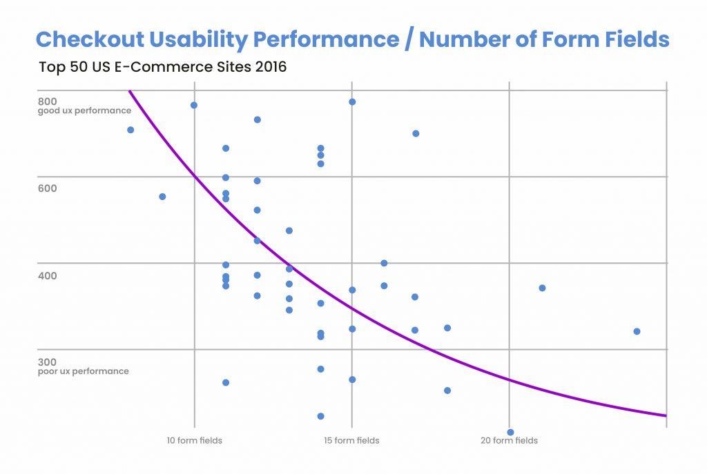
For context, a properly-optimized, user-friendly checkout flow only has 7 form fields on average, which is half the number that most eCommerce platforms offer. When you have over 15 form fields, users start getting frustrated, forcing them to discontinue the purchase.
When creating your form, limit the required fields to basic personal and billing information. Instead of using three different spaces for the first name, middle name, and last name, you can create one for the buyer’s full name. You can also use the billing address as the shipping address.
Once you realize the potential losses from complex checkout flows, you should consider simplifying it to a single page. Here are the advantages of using one-page checkout for your online shop.
If your checkout flow is straightforward, users won’t have to think for long before making up their minds about a choice. By eliminating all redundant form elements, you shorten the path to purchase, thereby reducing the rate of cart abandonment.
By increasing the number of purchases on your website, your business will maximize conversions and boost profits. Moreover, return customers don’t want to go through the process of filling out the form all over again. So, just get them to pay before they change their minds.
When a customer fills out a form, they want to get to the payment page as fast as possible — and any site that makes that a reality will become a popular shopping destination.
The last thing you want the customer to think when using your site is, “Ugh! Not another form!” With every frustrated sigh, the customer becomes disgruntled with your platform, which tarnishes the overall user experience.
Note: Some people argue that one-page checkout flows limit the number of data businesses can collect. But with modern analysis tools, you can get the best out of the relevant data obtained from the checkout form.

.
After analyzing a few eCommerce brands, we’ve gathered some successful tips for optimizing checkout flows. Use these tips when designing your online shop or vendor marketplace.
We’ve harped on this point throughout this piece — and with just cause. The checkout process needs to be linear, whether on the desktop or mobile version. Any extra pages that take the buyer on a protracted journey should not be on your checkout form.
Sometimes, you might need to add an extra page to declutter the main checkout page. In this situation, consider adding progress bars to the page to show the number of steps left. This technique will help customers track their progress, leading to fewer abandoned purchases.
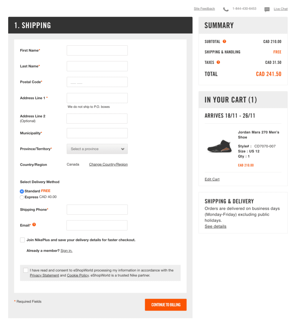
Alternatively, you can follow Nike’s example by adding the accordion checkout option to present as many form fields as possible.
Checkout optimization involves removing all unnecessary elements from the page. But brands can sometimes over-optimize in the quest for simplicity. Whatever you do, don’t forget to label the fields.
According to the Web Accessibility Initiative (WAI), all input elements must contain guides for people with disabilities. You can use placeholder text to inform the users about the type of information you want them to enter into the fields.
Also, use alerts and error messages to tell the user when the password is “too weak” or how to find the CVV on their credit card. Ultimately, you should never assume that the reader should know what to do.
Retailers use the checkout page to upsell and cross-sell items. While this practice might lead to more sales, doing it incorrectly can scare people away from your one-page checkout flow.
Apart from that, too much text and information on the checkout page can distract the user from completing the purchase. Therefore, consider stripping down the page to essentials, leaving only the navigation panel, the footer, and the form itself.
Online shoppers are always wary about sharing their personal details on websites due to privacy issues. As a business owner, it’s best to empathize with such shoppers, because they form a solid bulk of paying consumers.
Always provide an option to bypass registration. You can include this below the forms that enable the user to just share billing and shipping information without entering other sensitive data.
Alternatively, you can use a free shipping incentive to convince consumers to share their personal information with you.
According to JP Morgan, over 47% of online shoppers use their credit cards to pay for goods and services. But with the current spike in cybercrime, consumers are looking for alternative payment methods that don’t require sharing card details.
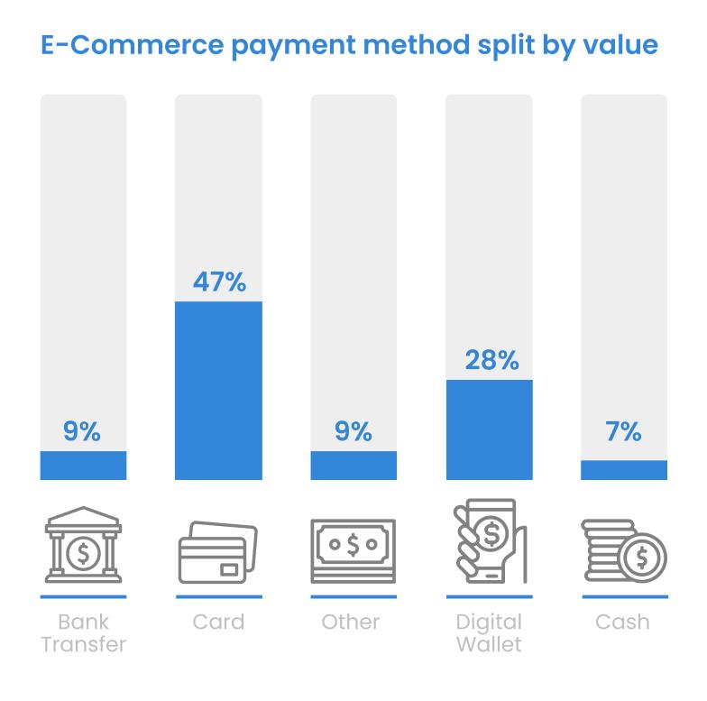
Besides, entering billing information takes time, which also contributes to cart abandonment. Therefore, using digital wallets and alternative payment options makes it easier for customers to close deals.
Brands like Etsy, Amazon, and Starbucks accept payments in Bitcoin. With the right development team, you can also add crypto payment options to your online shop.
When a shopper adds an item to the cart, they should receive a notification confirming this action and encouraging them to complete the payment. On mobile devices, this notification should be distinctive and create a sense of urgency.
Referencing the above discussion about privacy, customers want to make sure that their information is in safe hands. To reinforce a sense of protection, use security certificates and trust badges on the one-page checkout form.
Always use recognizable badges to create a sense of familiarity with customers. For instance, 45% of online shoppers can recognize the VISA secure payment seal.
By contrast, other lesser-known trust badges will raise eyebrows regarding your site’s safety. So, it’s better to have one recognizable badge than multiple unknown ones. Other notable additions include the Norton Security badge and the Better Business Bureau seal.
Another valuable badge that most eCommerce brands forget to add to the checkout page is a straightforward “Money Back Guarantee” seal.
Think about it: the customer needs some sort of guarantee that spending money on a store without a physical location is a risk worth taking. So seeing this badge just before they complete the payment reassures them that they can get a refund.
You can also add some user reviews as social proof, but do so only if they don’t clog the page with unnecessary filler content.
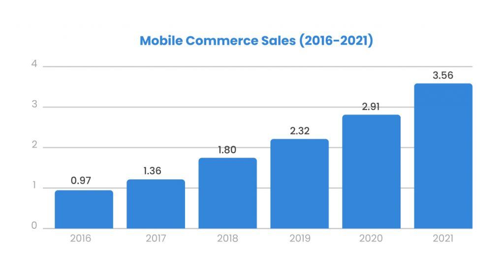
Your optimization approach should extend beyond the online shop’s desktop version. Since 72% of online shoppers use mobile devices, you should optimize the checkout form for smartphone and tablet users.
If possible, reduce the amount of information you display on the mobile version to essentials. With pain points like keyboard size and screen resolution affecting the mobile experience, try to keep things simple.
You can choose any checkout flow that suits your brand and audience, but you must test several versions before making final adjustments. That’s why it’s imperative you gather sufficient data about the customer’s interaction with the form field.
You should also conduct usability studies and use heatmaps to discover the areas that your consumers find difficult to navigate during checkout.
You can also test two versions of the one-page checkout flow using A/B testing principles. This technique will show you the version that ensures more completed purchases and fewer abandoned carts.
Tools like Usetrace and Chostinspector can help you detect checkout page flaws on your WooCommerce website before you launch it.
Simplifying complex checkout flows will not only improve the shopping experience on your eCommerce website but also boost your conversions. By applying the tips recommended in this article, you can decrease the cart abandonment rate significantly.
Just aim for a simple design that declutters the page of unnecessary elements and information. And, most importantly, continue testing and optimizing the checkout page to find the version that guarantees the most purchases.


In this article, we’ll address common eCommerce problems and present solutions to mitigate their impact.

The article explores the best B2B eCommerce website development strategies to help businesses boost conversions and stay relatable in the fast-changing economic landscape.

According to the Content Marketing Institute, only 16% of marketers indicate they have the right technology for the content management system (CMS) and are using it to its full potential.