A few years ago, people primarily shopped in local stores complete with parking, bad weather, long lines, and wobbly shopping carts. When online shopping was available, people felt uncomfortable using their credit cards and giving personal information to cyber-shops.
However, the world has changed. Consumers may still be concerned about the security of online shopping, but a majority of them are prepared to buy on the Internet. The eCommerce industry is booming, and current retail trends show 52% of users around the world prefer online shopping.

Reviews are a simple and effective way to make users trust your products. Add comments and review options. Also, be sure you use photos of high quality. The clients won’t buy items if they have poor quality pictures.
Your customers remember 70% of what they see and read. Big product photos along with quality web design are the two main points you should focus on if you want to have an eStore that is pleasing to the eye. And a clear feedback page is the perfect opportunity to collect the information about the brand.

Screenshot from Free People (see on www.freepeople.com)
Unless you’re competing solely on price, your website needs to be more than just a shop. You should be one step ahead since established brands have a customer base that trusts them and turns to them first for any needs.
As a new seller, you have neither a brand nor the ability to cut costs; use your unique product knowledge and skills to offer something unique. Write high-quality blog posts, add a link to your products, and establish yourself as an expert.

Screenshot from FiftyThree (see on www.fiftythree.com)
Bloggers have it easy. They can write hundreds of words a day of unique content, and if it’s good enough, people visit their sites. Unfortunately, eCommerce isn’t like that. It is particularly vulnerable to SEO problems, and many online stores have found themselves struggling in the relegation zone after the last few years of Google algorithm changes.
Optimize your product pages using special keywords. Use friendly URLs. Make the most of user-generated content (e.g. comments, reviews). Avoid duplicate content since it drags your site down. Have well-thought-of internal links. This reduces your bounce rates as people have something to click on. All in all, use Google Analytics to have a deeper knowledge of everything happening on your site.
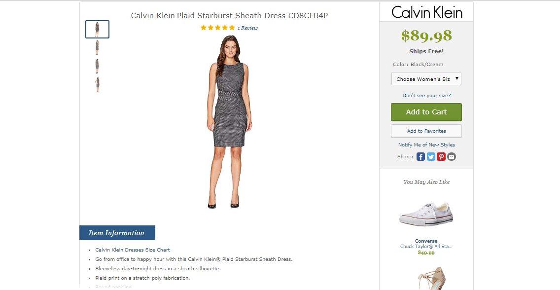
A great example is Zappos. They:

Screenshot from Zappos (see on www.zappos.com)
Newsletters are the secret weapon of eCommerce. For example, when you make a sale, prompt the user to sign up for a newsletter and tick it by default. In addition, be sure there’s a clear sign-up area on the homepage or sidebar. An example of effectively engaging customers is Amazon or eBay with their reminder systems to write a review or submit pictures a week after purchasing.
If your eStore looks like a website with a variety of links, users abandon it, especially if the page takes more than three seconds to load. In most cases, websites that load slowly significantly reduce your conversion rate. To avoid this, you need to create a design loading all of its information quickly to be an impressive website.
It takes about 40 milliseconds for customers to decide if they really like a website or not. You should be as creative as possible. Invest in the best design, choose the right template, make navigation clear, and deliver a unique experience for your users. Look at the Noble Isle website. They sell luxurious bath products. The rich color palette, gold fonts, and perfect logo are subtly clever as they infuse a sense of opulence without being over the top.

Screenshot from Noble Isle (see on www.nobleisle.com)
Once you’ve made the decision to build an eStore, the development process can be quite confusing and overwhelming. The reality of eCommerce is the best websites take time, effort, and technical knowledge. Of course, you don’t need to constantly live in fear of making a mistake. If you follow the right advice, you can create a highly successful eStore.