
Besides quality development and proper management, there is something else that makes a good product – smart design. So, in this article we are sharing some tricks on how to diversify the interface of your website or application, therefore, improving user experience in order to make users buy goods, subscriptions, etc.
Well, simply speaking, this is the experience of a user when interacting with the product. UX design most often determines what kind of experience it will be. And if we imagine it as a world that stands on three pillars, those will be – aesthetics, psychology, and marketing.
According to the Aaron Walter concept, a user has their own pyramid of needs – not to be confused with the Maslow pyramid, although one comes from the other. The basic need is functionality, next we have reliability (data security, if you will), then comes usability, and pleasure at the very top. And as in ordinary life: if all needs are satisfied, then everyone will be happy, and the product will definitely become popular.
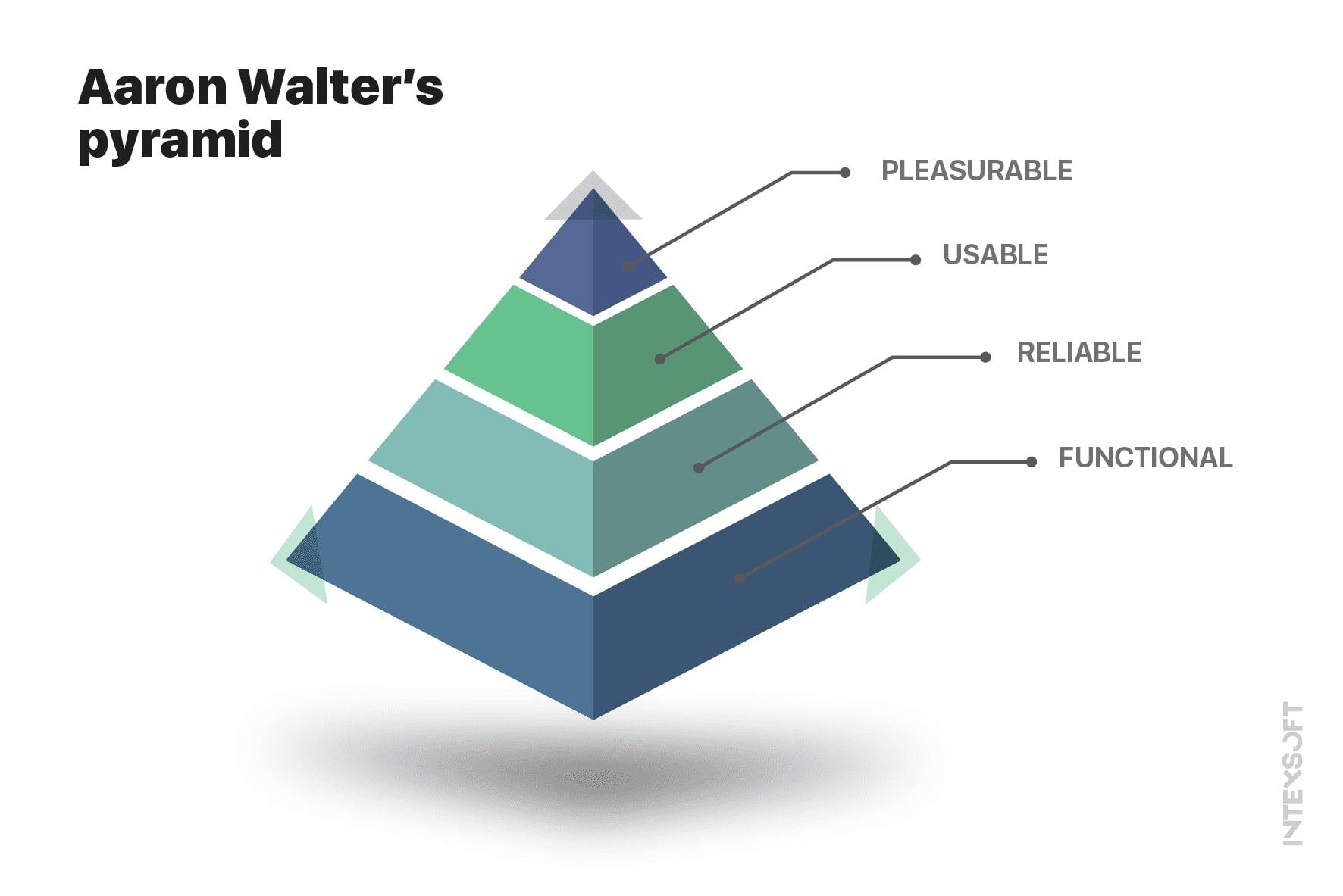
We are more likely to remember those things that cause emotions. And if the emotions are positive, then we strive to return to the source of those emotions over and over again. But how can we cause emotions via software? Interesting.
According to Aaron Walter’s concept of emotional design, certain patterns may cause different emotions, thereby enriching the user experience (UX) in a good way. Below we put, a list of these patterns and examples of how they can be implemented on real products. And if you want to know how to sell web design services check our partner’s material.
Aarron Walter’s keynote speech at Delight 2013 explains why emotional experiences are better ones, and how designing customer experience should focus on delivering something remarkable.
First of all, this is an onboarding page of the application. A nice greeting, or an offer of some little pleasant bonus. It’s also very important to provide the most convenient methods of registration and authorization.
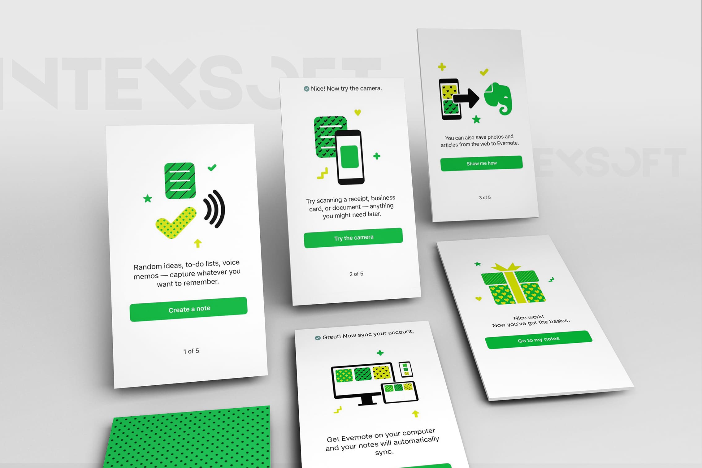
Onboarding screens in Evernote app
It’s imperative to maintain the overall style within the website or application. And this applies not only to colors but also to such small details as fonts, buttons, pictures, and animations. Their styles should match across all the pages.
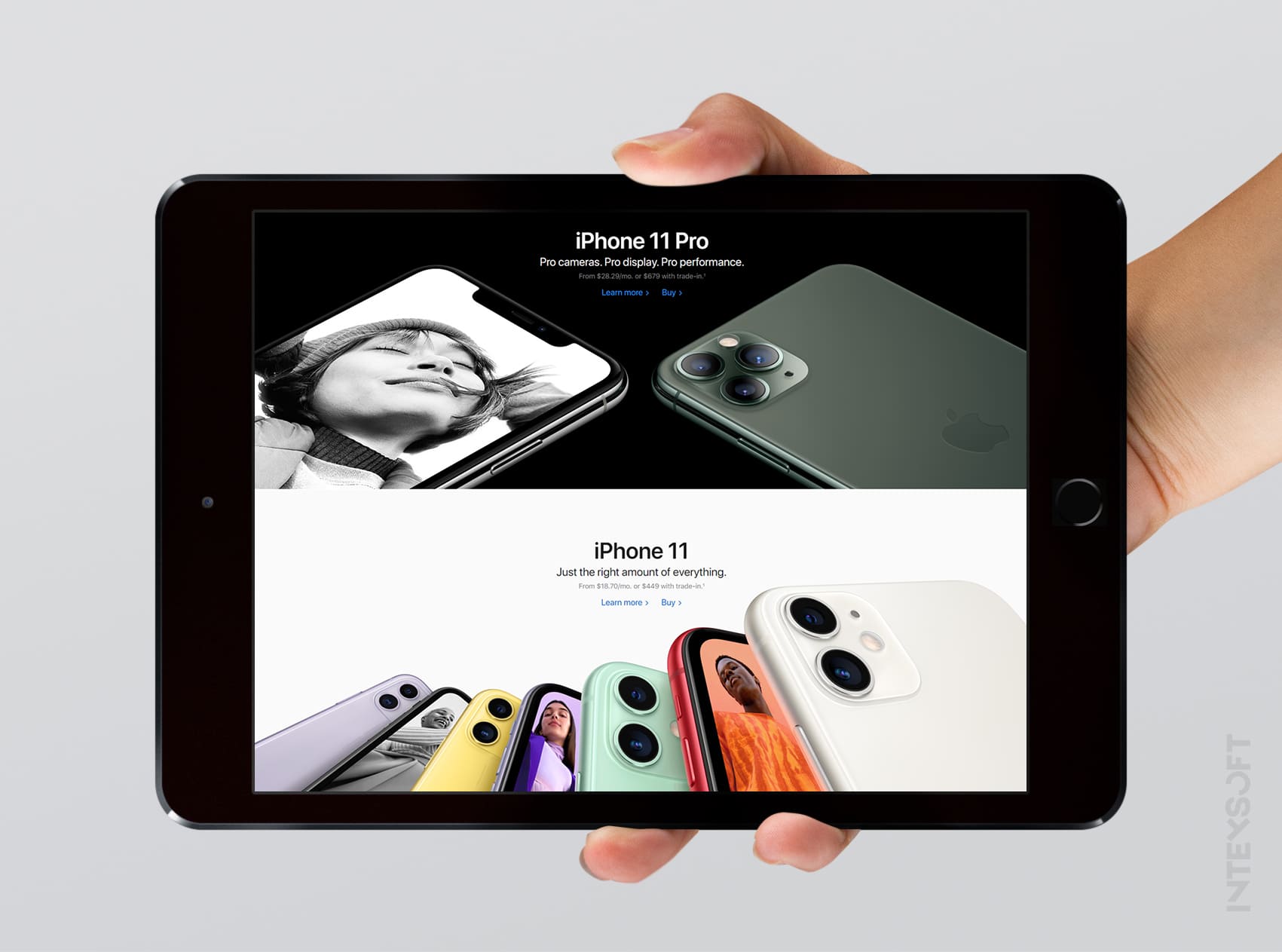
Homepage of apple.com
This can be attributed to the previous paragraph, but still, the essence here is a little different. The main idea is that you should not neglect small components: even if you have a simple design, there must be some zest in small elements. This applies to small switchers, buttons, any subtle elements. Thus, this causes user trust, as attention to detail is considered an important quality.
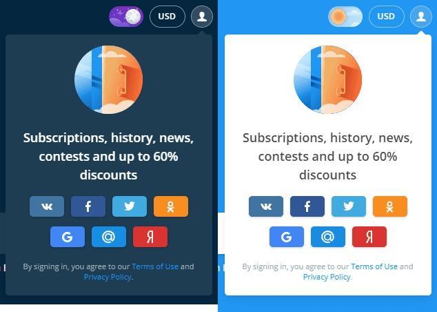
Dark/Light theme switcher on Aviasales website
Have you ever read an article, and at some point got to the blurred screen and the inscription like: “pay for a subscription to enjoy our content”, or whatever marketers can come up with. And also, there’s LinkedIn, which shows only a small portion of page visitors, but if you buy premium, you will be able see all of them. And since such large players continue to use such tricks, there’s no doubt that it works.

Page visitors on LinkedIn
When searching for goods or services, a user wants to learn some information before buying something. Therefore, the section with reviews is a must-have for any selling website and application. Also, it would be great to integrate a product rating system, and hints, for example: “239 copies were sold today”, or “9999+ users added this item to favorites” – such things create the impression of an in-demand product, which often leads to a purchase.

Rating and favorites on AliExpress
Even if you have a “serious” product, you should understand that your users are the people just like you and they want to experience positive emotions. Of course, you need to be more careful here, because some people may have a different sense of humor. You can develop a character or a mascot that personifies your product. It will accompany the user at all stages of interaction with a product and give relevant advice or tell jokes when it’s appropriate. We like the example of Mailchimp, or rather their character.

Jokes by Mailchimp mascot
There are many nice tricks to show customer care. E.g.: on iPhone, if you create a note that looks like an event, the system offers you to add it to the calendar. Yandex.Music often offers playlists that are compiled based on your preferences. Popular task manager Trello offers ready-made board templates:
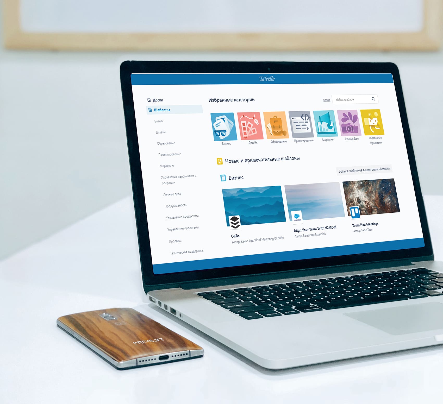
Templates suggested by Trello
Such emotions are usually triggered by beautiful interactive visuals, those can be the doodles that Google loves so much. You can also experiment with all sorts of quests and quizzes – the user completes them and gets something useful in return.

Doodles by Google
Any process can become much more interesting if you add a competitive moment. We really like sleep tracking in the MiFit application, especially when it says that “you sleep better than 43% of users”. It feels a bit better when you realize that you are not the only one sleepy.
Mi Fit sleep tracking
If you are selling goods, you need to add a good tracking system and proven payment methods to the application – the more the better. This will give the buyer a sense of control and reliability.
First of all, these are our “beloved” 404 pages. It’s better not to have such pages at all. But, if you do, it doesn’t mean that you can’t benefit from that. Add fun visuals, quizzes or links to useful content to smooth user experience.
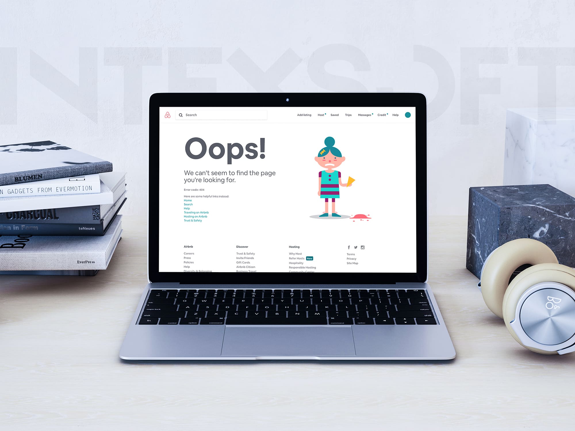
Airbnb error page
Well, there are many more such tricks and interesting examples. We tried, to include only essentials. If you have some interesting tricks to share, you are welcome to leave them in the comments. We will be glad to read and maybe adopt some of them for our further projects.