Use These Ecommerce UI/UX Insights to Win More Conversions


Factors like site speed, brand reputation, and data security all help determine whether customers will use your eCommerce website or go elsewhere. But in the current era of personalization, customer experience is the crucial determining factor in site conversions.
With top brands like Nike championing today’s focus on user experience, business owners worldwide are embracing eCommerce UI/UX design to boost engagement and increase ROI.
In this article, we’ve gathered insights from top brands to help you revamp the user experience on your eCommerce platform in order to attract more customers and increase conversions.
Data from Statista shows that over 6.2 billion people own smartphones — and that number continues to grow. Besides, over 60% of active online shoppers have made at least one purchase using their smartphones.
With these figures in mind, your business will benefit by devoting more attention to the mobile shopping experience. This means that your designers should first build prototypes for mobile screens before adapting the design to larger devices.
Another reason to focus on the mobile experience is that it helps SEO. WebFX claims that 74% of users will return to your site if the mobile experience is top-notch. And not only that, but Google also considers mobile usability when indexing sites.
Therefore, optimizing your site for mobile will help your rank higher as well as attract more customers.
The menu should always be accessible on all devices. For your site’s desktop version, use a sticky menu to ease navigation. You could also push the menu to the side or use the hamburger menu for both smartphones and tablets.
Apart from the menu, consider using a visual hierarchy to guide your users to related sections and categories on the page. You can also add breadcrumbs to the page to help the users know where they are on your site.
Additional features like a “Scroll back to the top” button will help users save time on your website — this increases the likelihood of them completing a purchase.
You have to make it easy for users to find information on your site without having to sift through several pages. Advanced search filters and keyword suggestions make it easy for shoppers to find specific items based on those items’ unique characteristics.
Voice search is another feature that most business owners neglect during eCommerce UI/UX design. If you don’t see the need to optimize your eCommerce platform for voice search, just know that you are eliminating over 27% of your potential audience.
Even if you are not in a hurry to implement voice search, use image search to make it easier for potential buyers to find your product. Other notable features that can help showcase your products include QR-codes, bar codes, and NFC tags.
One hindrance to online shopping is that shoppers don’t have the freedom to try out goods before buying them. But forward-thinking brands have figured out ways to bridge this gap.
As an online store owner, you can display your goods in a real-life setting using influencer-generated video reviews and demonstrations. YouTube channels like Unbox Therapy help brands market their products and demonstrate how to use them.
You can also kick things up a notch by using AI-powered virtual reality or augmented reality to deliver a realistic test drive for shoppers.
L’Oreal uses ModiFace, a virtual makeup visualizer, to enable virtual try-on for their cosmetic products.
So, if you own an online cosmetic shop, you can steal this idea to improve the user experience and outclass your competitors.
For products like sneakers and clothing materials, you can use a 3D rendering to display a 360-degree overview of the product.
The checkout page is the last step of the buyer’s journey on your site. But most eCommerce site owners have yet to realize that most people abandon their purchases at this stage — and this accounts for 23% of abandoned carts.
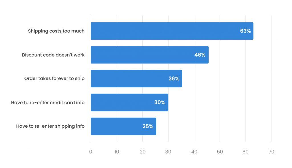
This hesitation to convert could result from a frustrating checkout filled with endless text fields. Or the shopper might be skeptical about using the payment portal on your site because it lacks trust badges.
One surefire solution to this problem is to adopt a one-page checkout form. By reducing the required information to only essential personal info and shipping details, you’ll reduce the path to payment, thus decreasing the likelihood of cart abandonment.
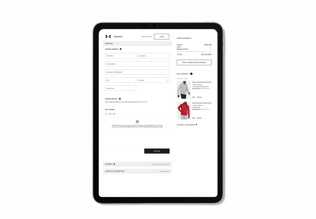
Here is a one-page checkout example from Under Armour. This checkout form works because it contains everything on a singular, UX-pleasing page. Note that the payment options include PayPal and gift cards.
Other brands like Amazon and Nike also use simplified checkout pages to improve the user experience.
Most business owners flood the product page with unnecessary information. Stop doing this; it only overwhelms the person trying to buy one product.
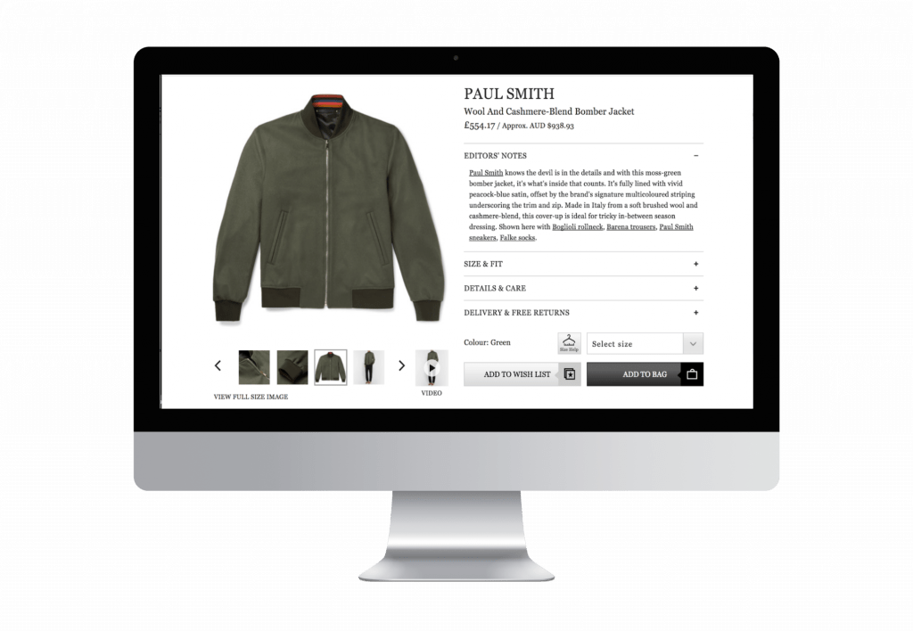
Follow these tips to optimize the user experience on your product page:
Providing support to shoppers is integral to the overall customer experience when using eCommerce platforms. You must always be available to offer guidance and answer your customers’ questions.
But staying awake at odd hours can pose a challenge, especially if you are managing the business alone. In this case, you can rely on chatbots to interact with customers in your absence.
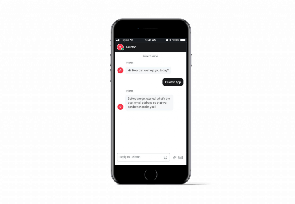
Unlike humans, chatbots don’t need coffee breaks; they deliver preprogrammed answers to frequently asked questions all day. And over 40% of shoppers would love to interact with a chatbot if it’s available on your platform.
However, your chatbot shouldn’t occupy the entire screen — and neither should the pop-up sound be annoying for customers. Make sure the live chat button stays in the corner without covering the content on the page.
You can also use AI-powered virtual assistants to provide more relevant customer assistance.
Your business loses potential customers whenever a shopper asks, “what does this button do?”
If people are asking this question when using your website, then you need to redesign the buttons and come up with better calls-to-action (CTAs).
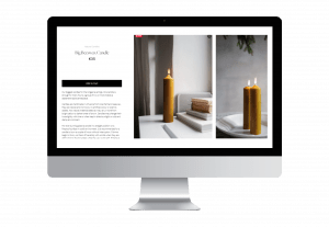
Every CTA you add to your product page should have a clear designation that is relevant to the product next to it. To avoid confusion, stick to standard CTAs like “Add to Cart” because they convey a clear message to shoppers.
Also, use contrasting colors to make clickable buttons stand out. You can vary the contrasts based on importance and relevance to the desired action on the page. Button differentiation can help you achieve this goal.
Designers without hands-on experience build page prototypes in one mode without considering alternatives for day and night usage. A report from Night Eye shows that over 80% of internet users prefer the dark mode, and 63% of shoppers expect sites to switch to dark mode automatically based on their device settings.
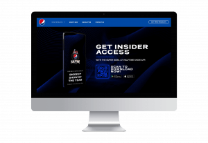
So it makes sense why brands all over the world are now creating dark modes for their sites. You can make your site more usable at any time of the day by including a button that can switch between modes.
Here are reasons why you should consider dark mode:
However, this doesn’t mean that light mode is terrible for users. The point here is to provide multiple options to meet the needs of different users.
Designers fall into the trap of designing eCommerce platforms for people like themselves. That’s often why features, font sizes, and color schemes focus on people without any disabilities.
But thanks to the increased focus on inclusivity, companies are now making their platform available to as wide an audience as possible. If you are a multinational brand, your eCommerce site must cater to the needs of people with disabilities.
According to the Web Accessibility Initiative (WAI), all input elements on the page must contain guides for people with visual impairment. Consider adding placeholder text to inform your users about the type of information you want them to enter into the fields.
Also, don’t forget to add read-aloud plugins to read the content on the page for visually impaired individuals. And if you are creating video content, use subtitles and closed captioning to ensure the message reaches everyone.
Google champions accessibility, as we can see in features like voice search, screen readers image search, speech-to-text, and multiple modes. They also analyze accessibility when ranking web pages.
You can take a page from Google’s accessibility initiative to make your brand more inclusive and user-friendly.
Improving the user experience is essential to staying competitive and increasing conversions for your eCommerce platform. With the help of talented eCommerce UI/UX design specialists, you can create engaging sites with simple navigation and optimized search features.
You can also use augmented reality and 3D visualization to help customers try on your product offerings before paying for them. And don’t forget to use AI-powered chatbots and live chat features to provide 24/7 customer support. And most importantly, make the site accessible to users of all demographics.
If you are looking for a company to help you design responsive and highly-customizable eCommerce websites, we’ve got you covered here at IntexSoft. Our developers will help you build an online store that generates traffic and profit.